Community Fibre
How CF improved conversion by 32% in their acquisition journey.
Product Design
*
CRO
* 01 / Project Overview
Community Fibre is one of the fastest growing broadband providers in the UK. They aim to serve their broadband, call and TV plans to a million London households and businesses by 2023. We successfully designed, tested and built their new website which boosted conversion by 32%.
my role
Responsible for the end-to-end design experience, from research to delivery.
the team
2 product designers, 1PM, 1 CPO, 1 data scientist, 6 engineers.
timeline
6 months aprox.
The impact
The new design saw an increase in conversion rate by 32%, followed by a 496% boost in sales after launching their new website.
* 02 / Problem statement
There's a clear business and value proposition that differentiates Community Fibre (CF) from the market but their website fails at communicating that back to its users. We stepped in oder to support their digital growth strategy and product offering.
Breaking down the problem
Our team was engaged to optimise the client’s website user experience and interface, focusing primarily on the new product offerings - Calls and TV, and the acquisition journey to improve conversion.
1
Saturated UI
A saturated layout led to user frustration and impacted conversion rates. To address this, we focused on simplifying and decluttering the UI through a redesign, emphasising clarity, intuitive navigation, and improved visual hierarchy to enhance user engagement and satisfaction.
2
Too much jargon
Users often reported not knowing the difference between most of the key technical aspects of the service offer, not even when put together in a comparison table.
3
Where's the UX journey?
Users had a hard time jumping from page to page in a chaotic and undefined screen flow, as a result of not having a well thought user journey. This affected all four key stages from awareness to retention.
4
People don't know what they need
Research showed how roughly 75% of users did not have capacity or enough knowledge to determine what service offer was best suited for their present or future needs. We knew it would be crucial to facilitate acquisition by tackling this issue.
* 03 / Process
During the process the team conducted a through UX audit of the exisiting website to be able to propose optimisation opportunities and to help users on the conversion journey. We looked at users’ behaviours on the site, conducted user testing and interviews to deep dive into their needs and pain points. We did competitive analysis to identify best practices and common features for telecom sites. After a few weeks of research and analysis, we found valuable insights and produced some low fidelity wireframes.
Design goals
key takeaways
Purchase intent doesn't necessarily translate into acquisition
Most visitors find attractive and competitive the service offer but are discouraged by the poor and confusing user experience.
Don't make users think
Contrary, the drop-off rates tracked around the acquisition funnel could indicate that people are finding rather confusing or long the order process.
Simplicity
Less is more. Clean out the clutter, and help users easily complete their tasks.
Consistency
We developed and introduced a components library to streamline modern usability patterns and make sure our designs were scalable.
Flexible and scalable
The design system must be the foundation for a set of new UI layouts across pages that will introduce new services, offers and add-ons in a modular approach.
* 04 / Solution
Final outcome
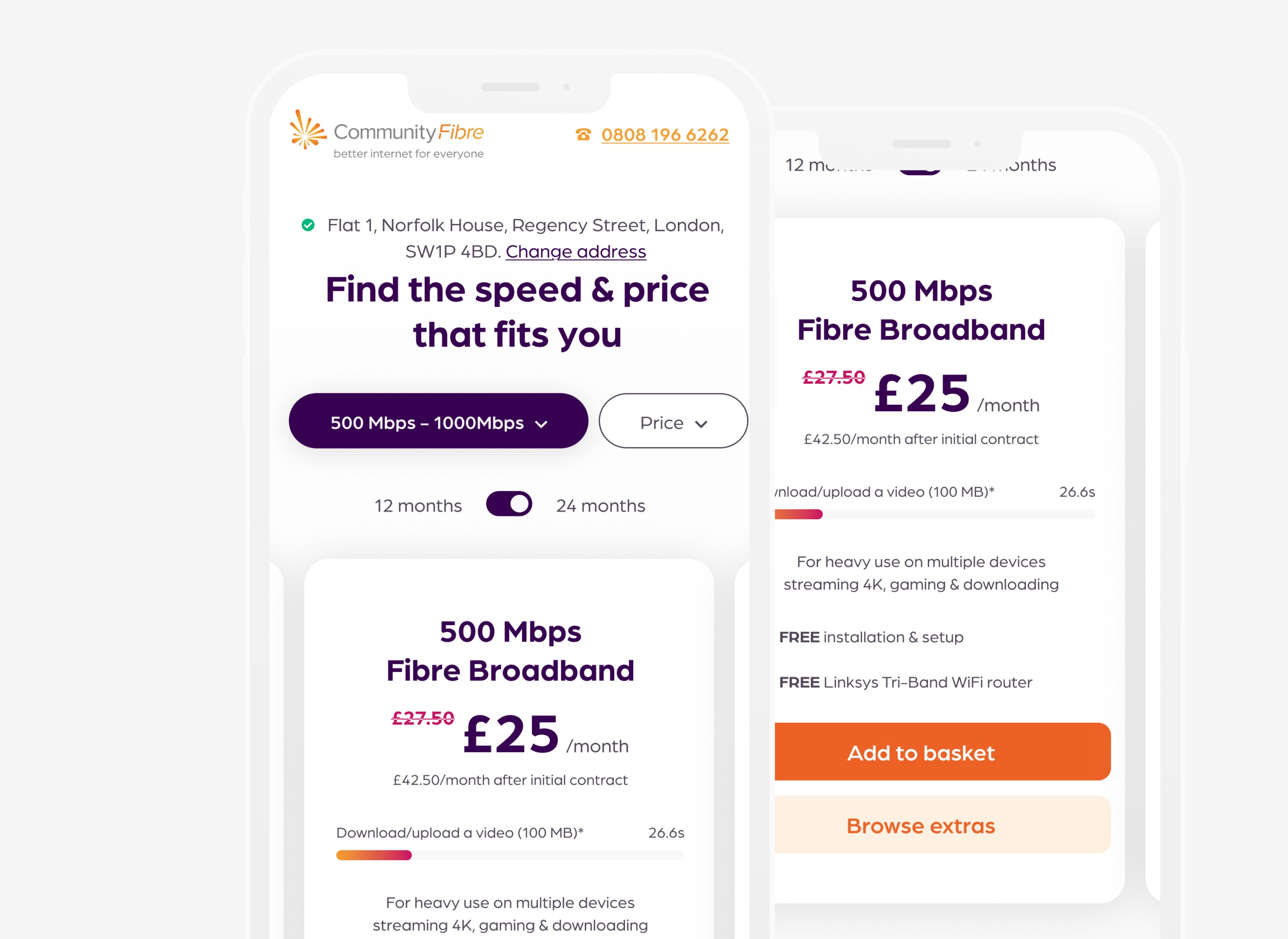
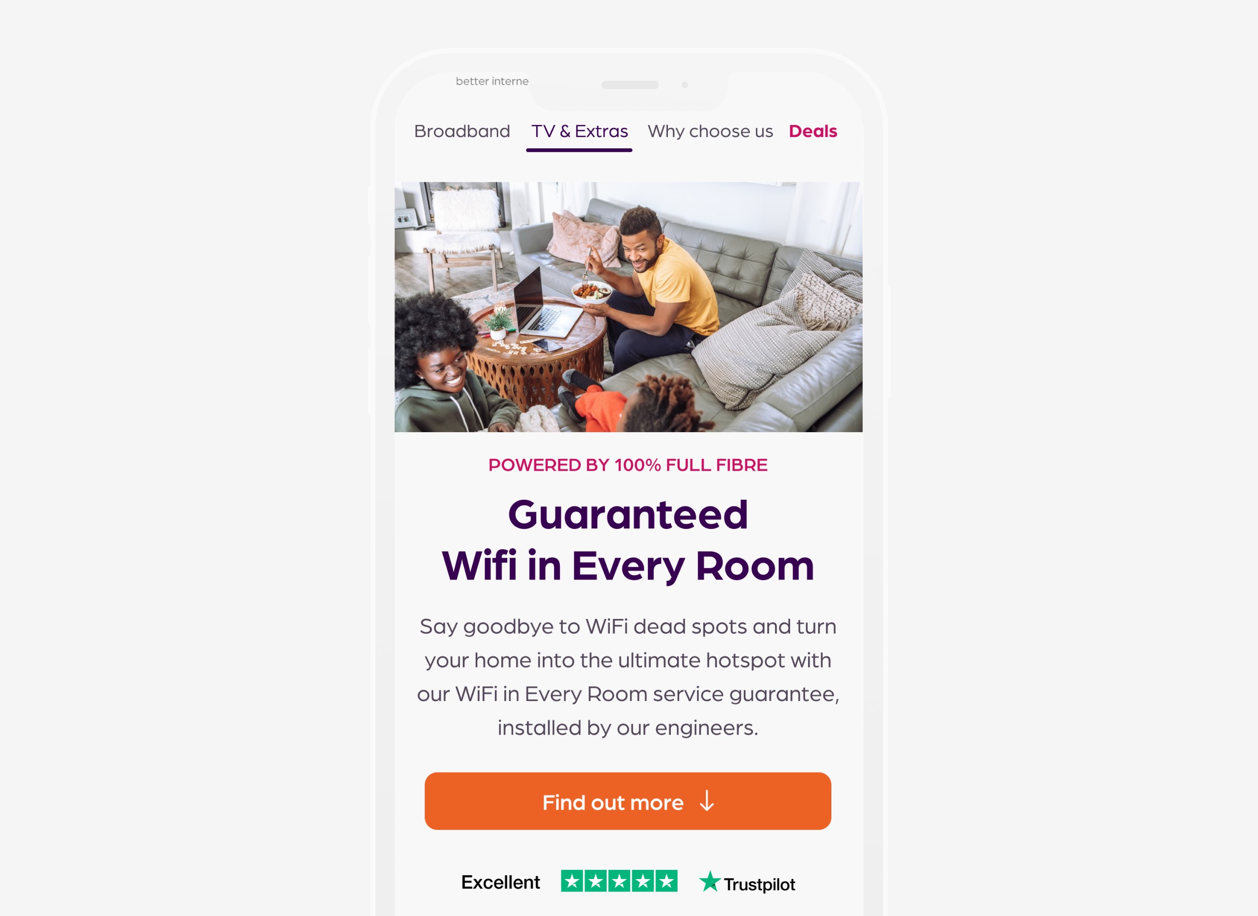
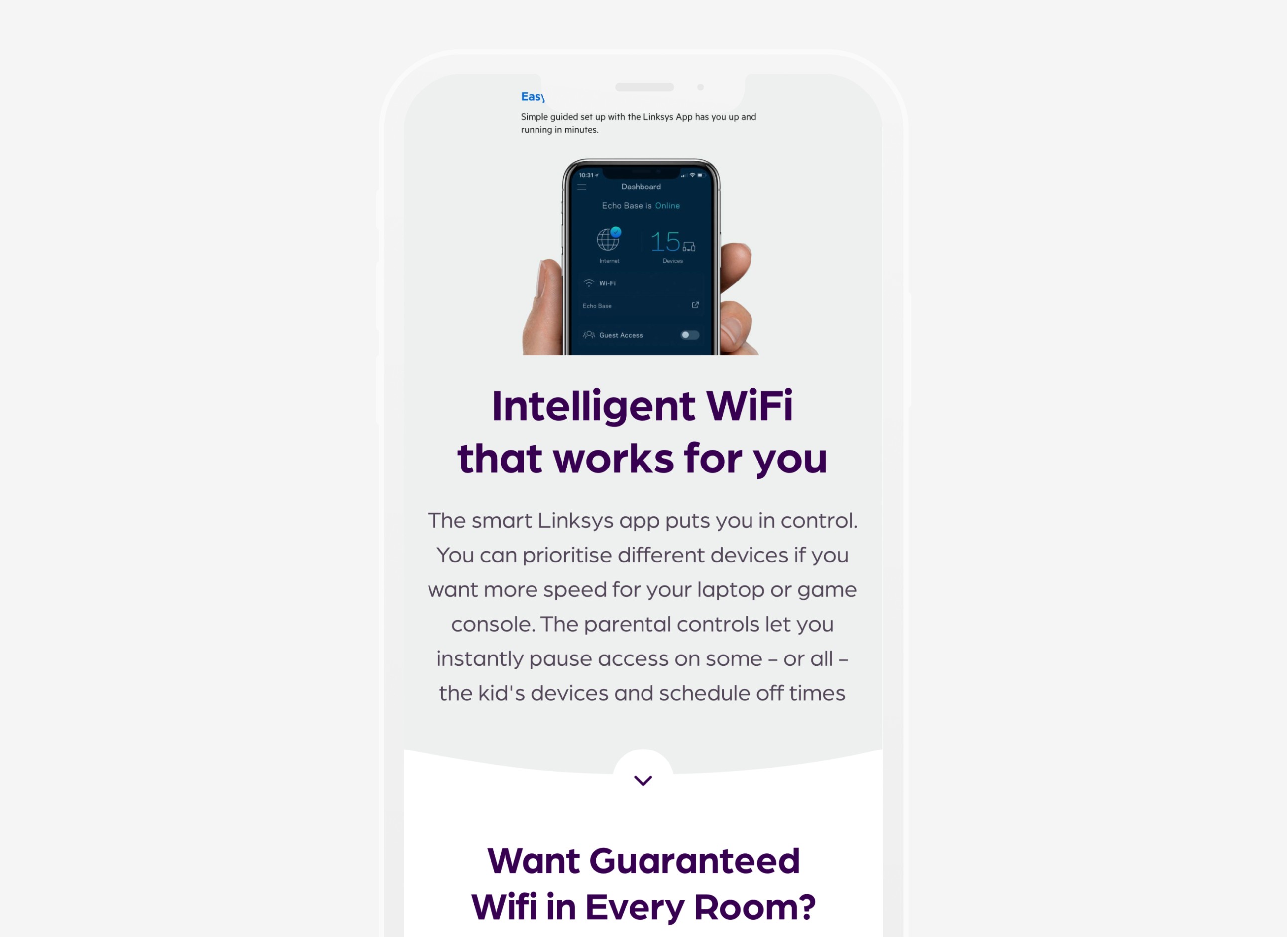
We successfully delivered the new website which resulted in an improvement in their conversion rate. The redesign also resulted in a reduction of call-centre calls helping to reduce the total number of enquiries during the Covid-19 pandemic. To keep consistency with the brand and with different teams working on different part of the website, we also created a design library with all components available to use.

A customisable product package as flexible as CF's contract terms
USER SCENARIO
Finding what you need can take a lot of time and effort, specially if you don't know what you are comparing here. We documented a big aversion towards technical jargon and a big disconnection from real-world user scenarios.
SOLUTION
Our solution involved humanising the language used to make it more relatable and accessible. Visual cues and interactive elements remove cognitive load now, promoting clarity and transparency, and ultimately boosting trust and engagement.
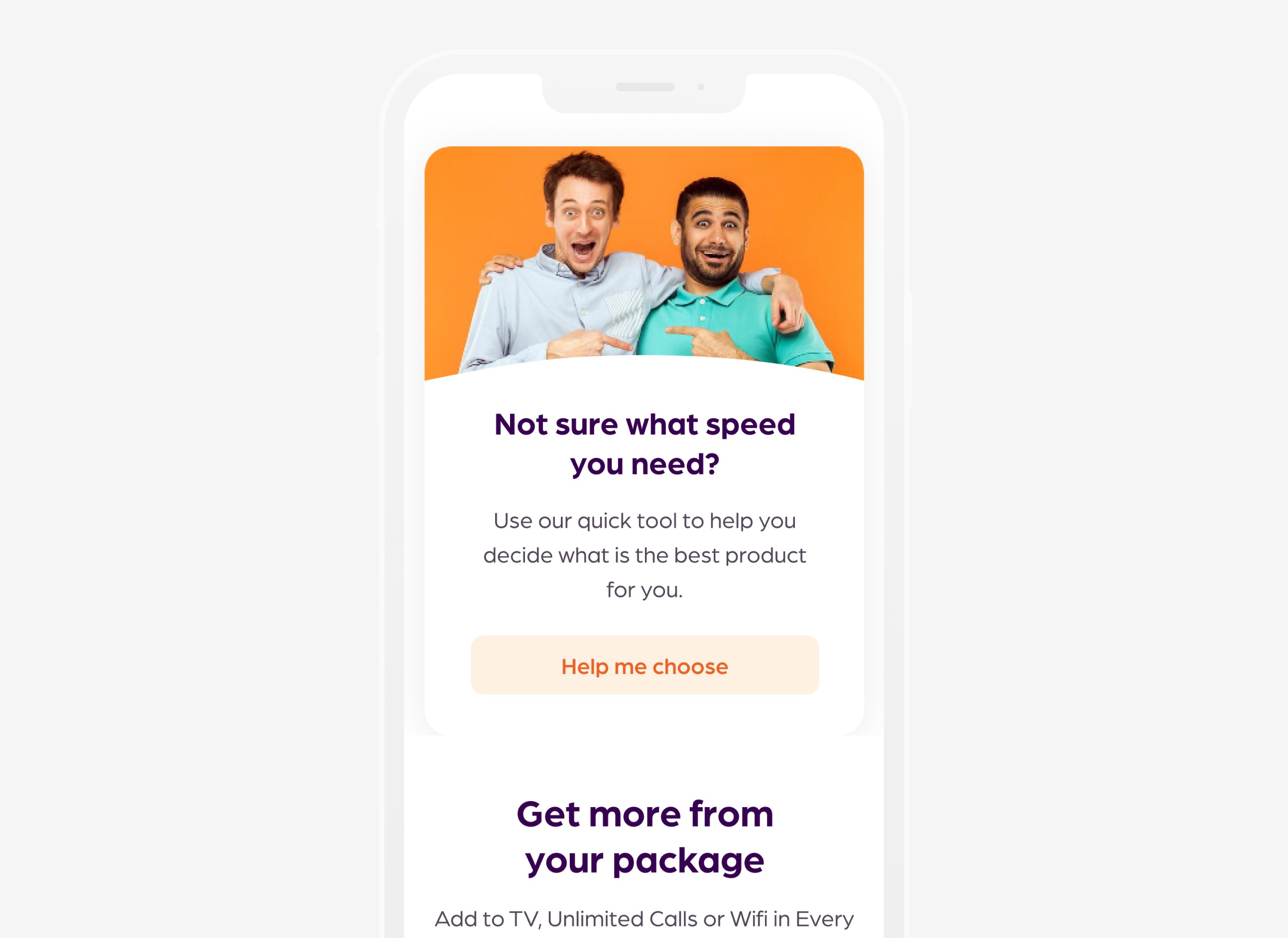
Help me choose tool (Don't make me think)
USER SCENARIO
Scared of all the infinite MB, 5Ghz and all the technical jargon? We get it. To be a successful product for every household we knew we had to lead by example with CF's user experience.
SOLUTION
To empower users feeling overwhelmed by technical jargon or lacking time, we designed a "Help Me Choose" tool. This interactive feature guides users through product selections based on their needs and preferences, using industry data, existing customers feedback, our current offers, and input from your answers.
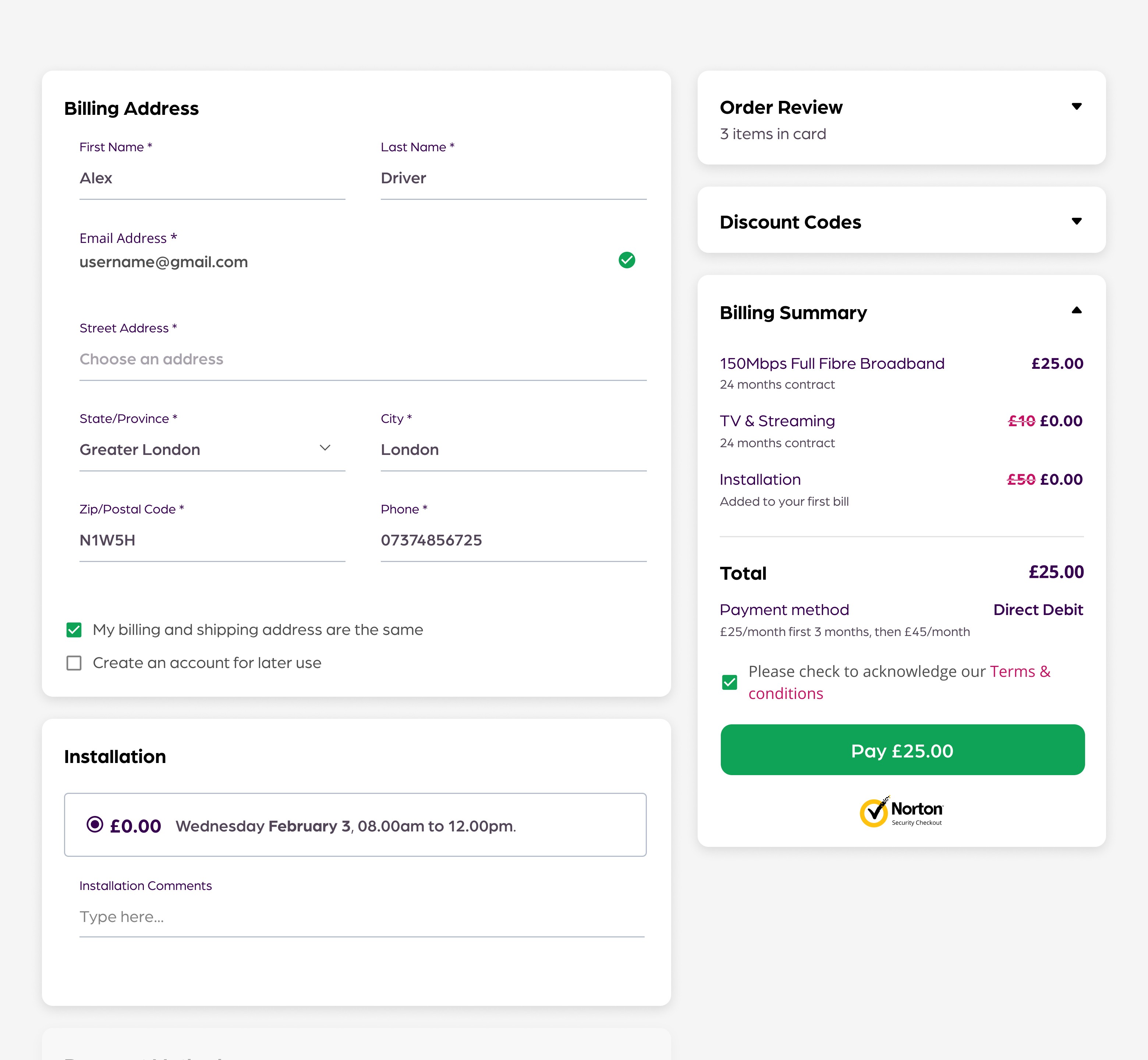
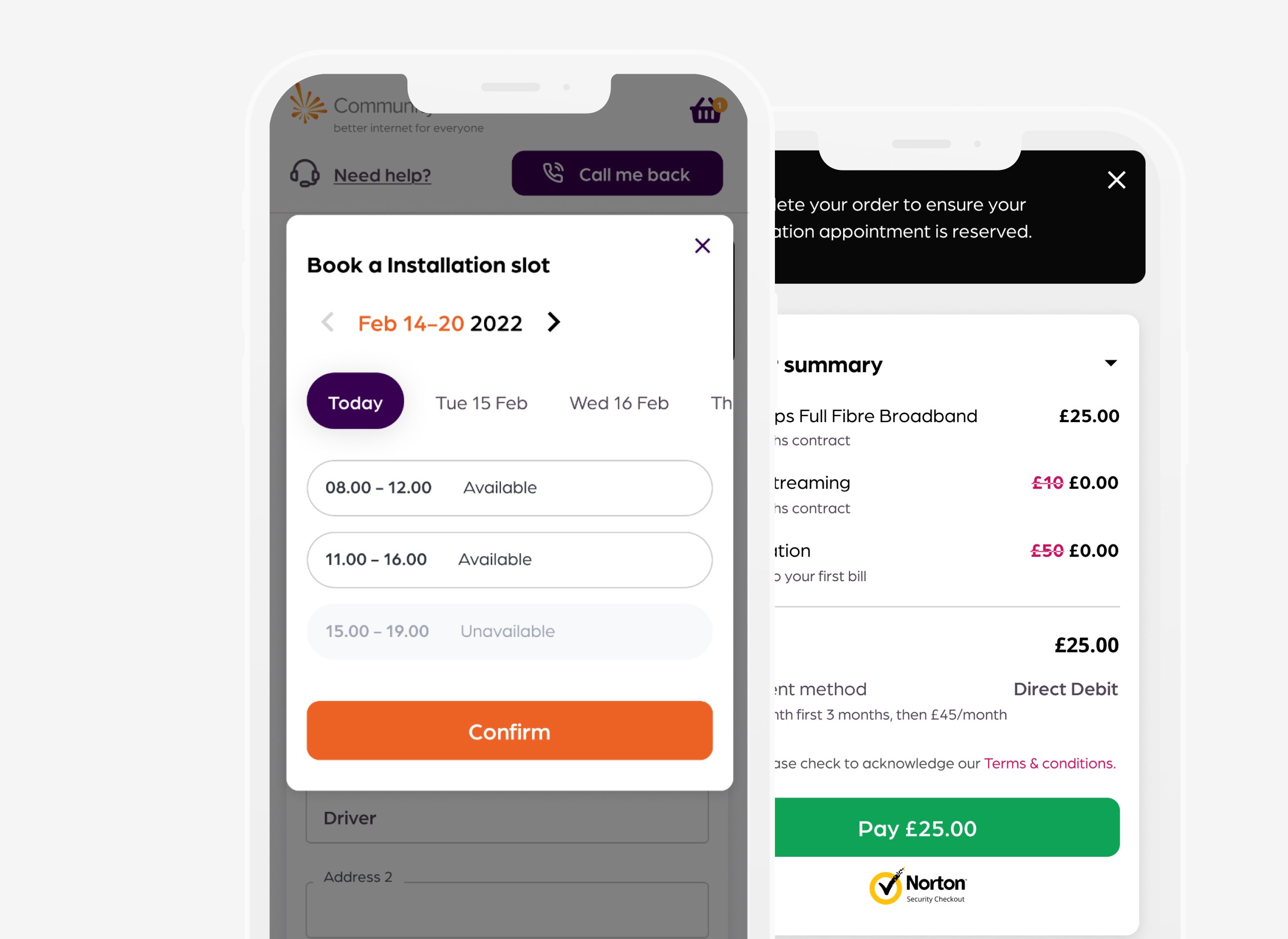
Revamping the checkout
USER SCENARIO
Complex process, unclear messaging, and a lack of personalized guidance. Users encounter a confusing and lengthy signup flow. This lack of clarity and excessive steps could have frustrated potential customers, leading them to abandon the checkout before completion.
SOLUTION
We revamped Cf's checkout experience by simplifying the process and integrating clear messaging to boost conversion, acquisition, and loyalty. Streamlined steps and personalised recommendations were introduced to enhance customer satisfaction and retention.
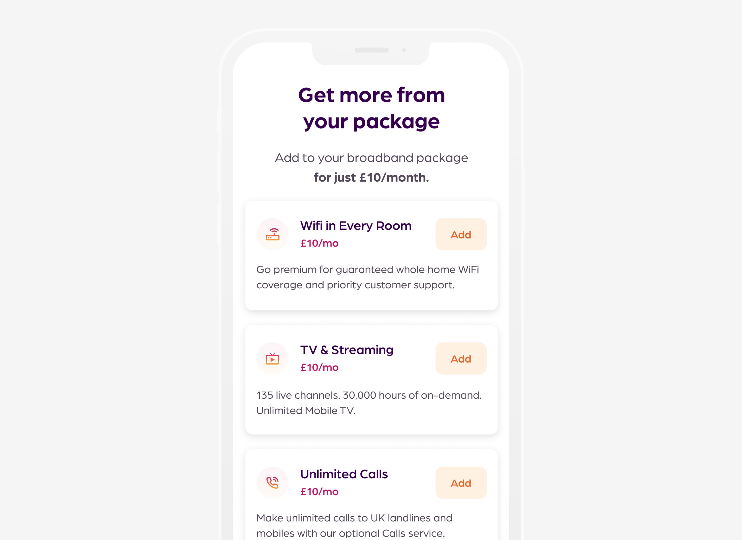
Scaling the product offer (addons)
USER SCENARIO
Community Fibre faced a challenge in presenting their expanding range of products – broadband plans, calls, TV options, and various add-ons.
SOLUTION
We designed a clear and consistent flow for users to navigate these diverse offerings with different entry points featured along the user journey. We also launched a components library that lays the groundwork for a future-proof solution as products evolve.
* 05/ Learnings
Taking notes for the future.
We ran unmoderated usability tests and split test the new design versus the live one We validated the designs with users before developing the new designs to make sure they would find it easy to navigate. We also split URL tested the new home design versus the existing one to monitor the impact. The new design saw an increase in conversion rate by 32%. Our input allowed for us to be appointed as their incumbent design partner.
Want to know more?
Book an interview with me to get extended
insights and answer all your questions.


